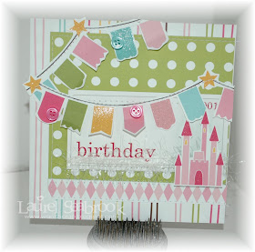
When I saw the sketch this week from Techno Stamper I thought of the Pebbles banners in the Ever After Collection and wanted to use them. So I am working on building my stash of birthday cards for the kids in my classroom this coming year.
I was also inspired by the City Crafter challenge :
Here are the two I made tonight, which fit the Less is More challenge - button or ribbon.
The sketch from Techno Stamper:
The pattern paper is from Pebbles. I fussy cut out the banner and the castle. The journaling spot is from Pretty Little Studio.
I was also inspired by this sketch from The Sweet Stop (although I fudged it a bit)
Again more fussy cutting and the flashcard is again from Pretty Little Studio.


So cute!!! Love the colors and the LO'S :-)
ReplyDeleteYou have been busy ! All of your creations Re gorgeous, fabulous layouts and great colours and embellishments.
ReplyDeleteMarie
Fabulous pretty papers and a great take on the sketch. Gorgeous! Lynn x
ReplyDeleteLuarel these two cards make quite a pair, I love the fussy cut banners!
ReplyDeleteWonderful cards and a brilliant representation of the photos ... thanks so much for playing along with us at CCCB ...
ReplyDeleteThese are adorable, and perfect for little girls' birthdays!
ReplyDeleteLove your cards! Such pretty papers and fab lay outs!
ReplyDeleteThese are so pretty! Such a soft and sweet look.
ReplyDeleteOw they are so sweet lovely colors!
ReplyDeleteSUPER cute cards--I love that castle and the banners! SO FUN!
ReplyDeleteSo sweet, so lovely, thanks for playing along with us at CCCB!
ReplyDeleteYour cards are fantastic bit for us at Less is More we like to see 'white' space on our cards
ReplyDeleteDo hope you will want to come back with a CAS design
Thank you
Diva LIm
"Less is More"
Two very pretty cards, lovely.
ReplyDeletemmmmmm. delicious cards and colors!
ReplyDeleteThese are fabulous cards Laurel, but at "Less is More" we need to see areas of white space and little in the way of layers.
ReplyDeleteThanks so much and do join us again for another CAS schallenge.
Chrissie
Lady LIM
"Less is More"
Pretty cards. I like all of the colors together.
ReplyDeleteGoodness! How sweet and adorable these are! So perfect for some lucky little girl. You are so wonderful to make handmade cards for your students. :)
ReplyDeleteI think your take on my sketch is just brilliant! I love the banners and the colors! Beautiful cards. Thanks so much for playing along with my sketch challenge this week!
ReplyDeleteso pretty! love the castles and banners:)
ReplyDeleteI love your use of banners on both of the cards! I think I'll never tire of that trend!
ReplyDeleteThese are adorable. I just love those banners.. Thanks so much for playing along with us at CCCB!
ReplyDeleteThese are so FABULOUS! Love them!!
ReplyDeleteThank you so much for joining us at CCCB!