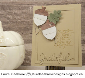
Once again I have used the Warm and Cozy collection from Pebbles. I have used a few different dies, along with an older Technique Tuesday stamp.
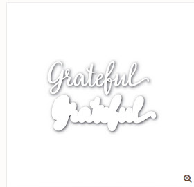
The acorn die is from Casual Fridays,, the rectangle and 'grateful' dies are from Simon Says, the leaf die is from PTI, the small stamped acorns are from the Fall in Love stamp set by StudioL2E and finally the main sentiment is from Technique Tuesday.
Playing along with the Simon Says - Pop it Up challenge
and the sketch is from:


How adorable! Those pieced acorns make me so happy, and what a great sentiment! Love how you added the smaller stamped acorns around the images, too, and the Kraft background is so perfect for this time of year!
ReplyDeleteSo pretty and perfect for the fall! Thanks for sharing at Less is More!
ReplyDeleteSuch a beautiful card, the staples are fab and i love all the dimension.
ReplyDeleteThanks for sharing with us at Simon Says Stamp Wednesday Challenge xx
Super card Laurel and it is perfect for the autumn season. So glad that you kept the frame and the die-cut 'grateful' in the same colour as the base card to help keep and impression of CAS. Thanks so much for popping this in at Less is More xx
ReplyDeleteMy heart is going pitter-patter over this darling card! Beautiful textures!
ReplyDeleteA beautiful fall card here, Laurel. The minimal colour palette helps keep it CAS while achieving great dimension. Thank you for joining us this week at Less is More. Trina :)
ReplyDeleteI love how you used die cut elements here Laurel to add detail and dimension. The tone and texture makes for a lovely autumn card! Thanks for joining us at Just Add Ink this week.
ReplyDeleteLovely - I really like how you have created a frame for your sentiment. The tone on tone for the sentiment is great too. Chantell Just Add Ink
ReplyDeleteA fabulous card Laurel, a super design and lovely sentiment.
ReplyDeletePauline - Crafting with Cotnob
x